In the basement of a converted Victorian warehouse in Shoreditch, type designer Marcus Webb is doing something that would have been unthinkable five years ago: building a contemporary brand identity around letterforms created in 18th-century Parma. His client, a luxury skincare company launching across Europe, specifically requested something that felt "timeless but not traditional, elegant but not elitist."
Webb's solution? A custom typeface based on the geometric principles of Giambattista Bodoni, the legendary Italian typographer whose mathematical approach to letter design created some of history's most enduring fonts.
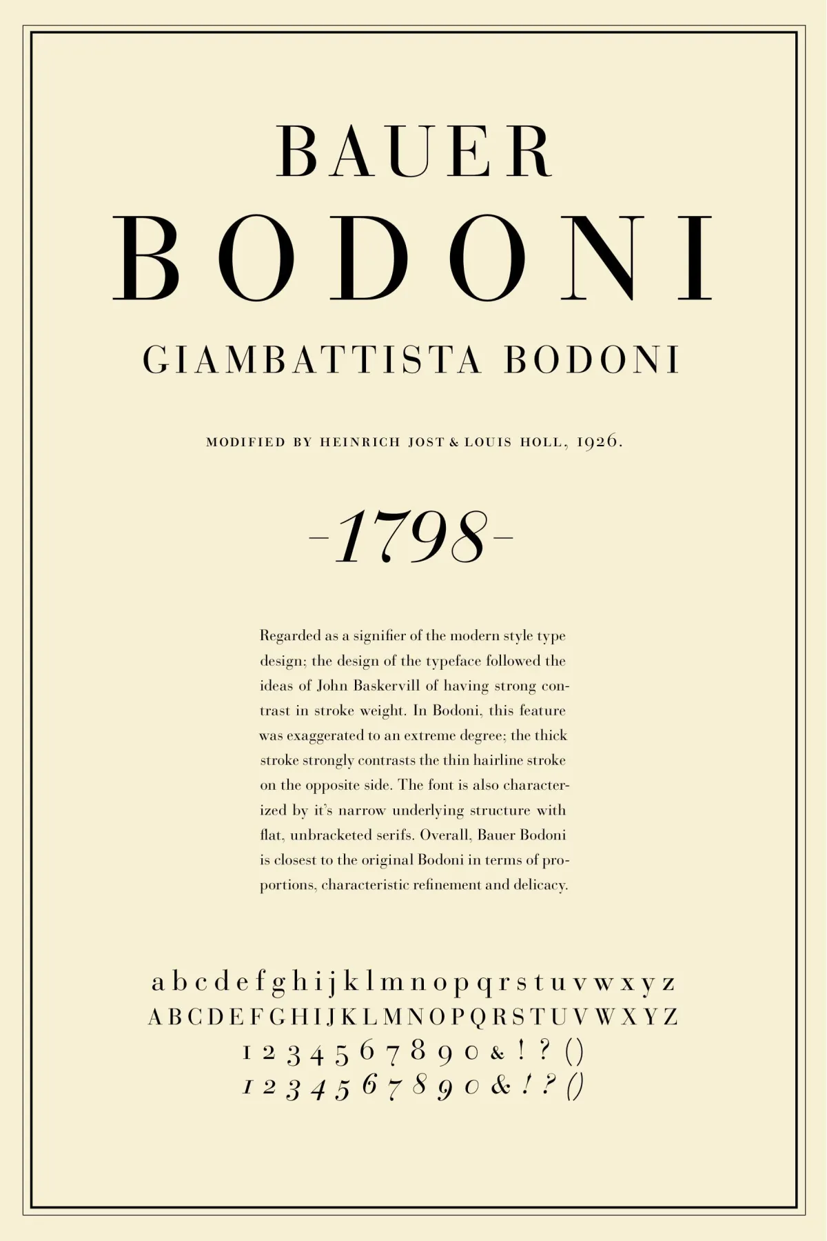 Photo: Giambattista Bodoni, via i.pinimg.com
"British design has spent the last decade obsessing over sans-serif minimalism," Webb explains, adjusting the spacing between letters on his screen. "Everything had to be clean, neutral, forgettable. But clients are starting to realise that forgettable isn't necessarily good for business."
Webb's project reflects a broader trend quietly reshaping British graphic design. Across London, Manchester, and Edinburgh, studios are rediscovering the rich typographic heritage of Italy—not as historical curiosity, but as a source of distinctive visual identity in an increasingly homogenised design landscape.
The Bodoni Revival
Giambattista Bodoni's influence on contemporary British design extends far beyond Webb's skincare client. His typefaces, characterised by extreme contrast between thick and thin strokes and razor-sharp serifs, are appearing in contexts that would have seemed impossible during the peak of modernist design orthodoxy.
Last year, Manchester-based studio Format created a complete visual identity for a tech startup using a heavily modified Bodoni variant. The decision, creative director Sarah Molloy admits, raised eyebrows among colleagues accustomed to the safe neutrality of Helvetica and its descendants.
"The client's first reaction was panic," Molloy recalls. "They thought we were making them look old-fashioned. But when they saw how it performed in digital contexts—how it cut through the noise of identical sans-serif competitors—they understood what we were after."
The startup's conversion rates improved by 23% after the rebrand, a result Molloy attributes partly to the distinctive typography's ability to create immediate visual differentiation.
"Bodoni forces you to look," she explains. "In a world where most brands are trying to disappear into the background, sometimes you need letters that refuse to be ignored."
Renaissance Humanism Meets Digital Pragmatism
While Bodoni's geometric precision appeals to designers seeking dramatic impact, other British studios are drawn to the more subtle charms of Renaissance typography. These humanist letterforms, developed in 15th-century Italy, offer a middle ground between classical authority and contemporary accessibility.
London-based designer Emma Hartwell has built her practice around what she calls "new humanism"—contemporary interpretations of Renaissance type principles applied to modern brand challenges. Her recent work for a chain of independent bookshops demonstrates the approach's versatility.
"Renaissance typography was designed to be read," Hartwell notes, displaying samples of the bookshop's signage. "These letterforms evolved from handwriting, so they have an inherent warmth and humanity that most digital fonts lack. But they're also incredibly sophisticated—the proportions, the spacing, the rhythm of the text. It's centuries of refinement."
The bookshop identity uses a typeface inspired by the work of Francesco Griffo, the 16th-century punchcutter who created some of the earliest italic types. Hartwell's contemporary version maintains the flowing, organic quality of Griffo's originals while adding the technical precision required for digital applications.
 Photo: Francesco Griffo, via www.griffoanniversary.com
"The goal wasn't historical accuracy," she clarifies. "It was to capture something essential about how these letters make people feel when they read them."
The Psychology of Italian Letters
The growing appeal of Italian typography among British designers reflects more than aesthetic preference—it taps into fundamental psychological responses to letterforms that transcend cultural boundaries.
Dr. Kevin Larson, a reading researcher who has studied typographic perception, suggests that Italian typefaces trigger specific cognitive associations that can enhance brand perception.
"Serif typefaces, particularly those with classical proportions, are consistently rated as more trustworthy and authoritative than sans-serif alternatives," Larson explains. "But Italian typography adds another layer—these letterforms carry centuries of cultural association with craftsmanship, luxury, and refinement."
This psychological dimension explains why Italian-inspired typography is particularly popular among British brands seeking to establish premium positioning. From artisanal food companies to luxury consulting firms, businesses are discovering that the right typeface can communicate values that would take paragraphs of copy to express.
Technical Challenges and Creative Solutions
Adapting historical Italian typefaces for contemporary use requires significant technical expertise. Many original designs were created for specific printing technologies and don't translate directly to digital media without careful modification.
Type designer James Morrison, whose London studio specialises in historical revivals, describes the process as "archaeological reconstruction." Working from original specimens—often damaged or incomplete—Morrison and his team must extrapolate entire character sets from limited source material.
"Bodoni never designed a hashtag or an email symbol," Morrison observes wryly. "So we have to become forensic typographers, understanding the underlying principles well enough to design characters that Bodoni himself might have created."
Morrison's recent revival of a 16th-century Venetian typeface required creating over 200 new characters while maintaining absolute fidelity to the original's aesthetic principles. The resulting font family has been licensed by brands ranging from boutique hotels to international law firms.
Digital Renaissance
The resurgence of Italian typography coincides with broader technological developments that make historical typefaces more practical for contemporary use. Improved screen resolution, better font rendering, and responsive design techniques have eliminated many of the technical barriers that previously limited serif usage in digital contexts.
"Ten years ago, you couldn't use Bodoni on a website because it looked terrible on low-resolution screens," notes web designer Claire Thompson, whose Liverpool-based practice has pioneered the use of classical typefaces in digital environments. "Now, with retina displays and improved font technology, these typefaces look better on screens than they ever did in print."
Thompson's recent project for a luxury travel company demonstrates this evolution. The site's navigation uses a custom Bodoni variant that remains perfectly legible across devices while maintaining the dramatic visual impact that makes the brand memorable.
Cultural Resonance
The appeal of Italian typography among British designers may also reflect deeper cultural currents. In an era of rapid technological change and global homogenisation, historical typefaces offer a sense of permanence and authenticity that resonates with both designers and their clients.
"There's something reassuring about using letterforms that have survived for centuries," reflects Webb, the Shoreditch type designer. "They've been tested by time in a way that contemporary fonts haven't. When you build a brand around Bodoni, you're connecting to a tradition of excellence that goes back generations."
This historical connection doesn't necessarily mean conservatism. Many British studios are using Italian typography as a foundation for radical experimentation, combining classical letterforms with contemporary graphic treatments to create identities that feel both timeless and urgently modern.
The Future of Letters
As British design continues to evolve, Italian typography seems likely to play an increasingly prominent role. The combination of historical authority, technical sophistication, and psychological impact offers brands a powerful tool for differentiation in crowded markets.
For designers like Webb, the trend represents more than aesthetic preference—it's a return to fundamental principles of visual communication that the digital revolution temporarily obscured.
"We spent so long trying to strip everything away, to make design invisible," he reflects, watching his Bodoni-based identity take shape on screen. "But sometimes visibility is the point. Sometimes you want people to notice that you've thought carefully about every letter, every space, every detail. That's not showing off—that's showing respect."
As he speaks, the letters on his screen seem to embody this philosophy: each character precisely crafted, historically informed, unmistakably Italian in its elegance, yet perfectly suited to its contemporary British context. In the marriage of Renaissance refinement and modern pragmatism, a new chapter of British design history is being written, one beautifully considered letter at a time.