The Geography of Letters
Walk into any WHSmith and you'll see the same sanitised fonts marching across magazine covers like digital soldiers. But venture into London's independent publishing quarter—from Bermondsey to Bethnal Green—and you'll discover something revolutionary happening. Small British publishers are abandoning the tyranny of Helvetica and embracing letterforms that carry the dust of Italian piazzas and the whisper of regional dialects.
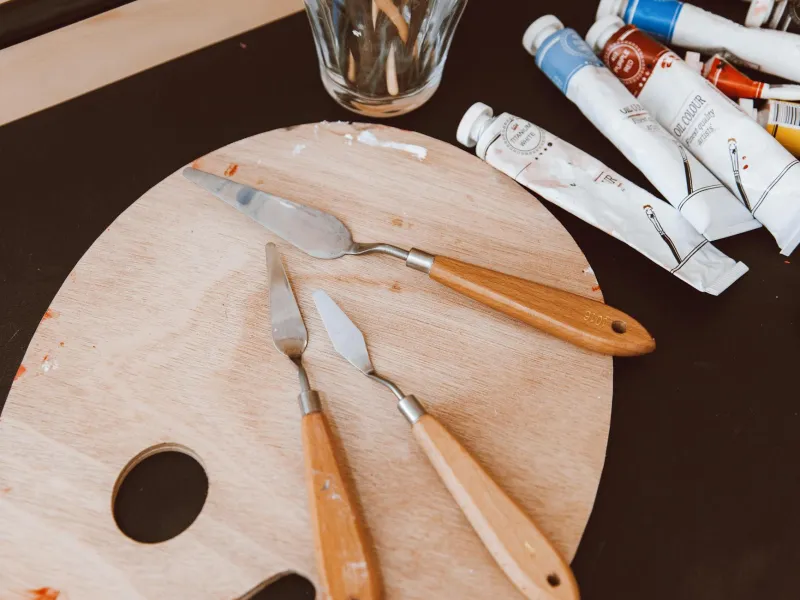
"Typography is the architecture of language," explains Sarah Chen, founder of Liminal Press in Manchester. "When we started using letterforms inspired by Venetian incunabula for our poetry chapbooks, something magical happened. Readers began touching the pages differently, reading more slowly. The letters weren't just delivering words—they were creating atmosphere."
 Photo: Sarah Chen, via is2-ssl.mzstatic.com
From Venice to Vauxhall
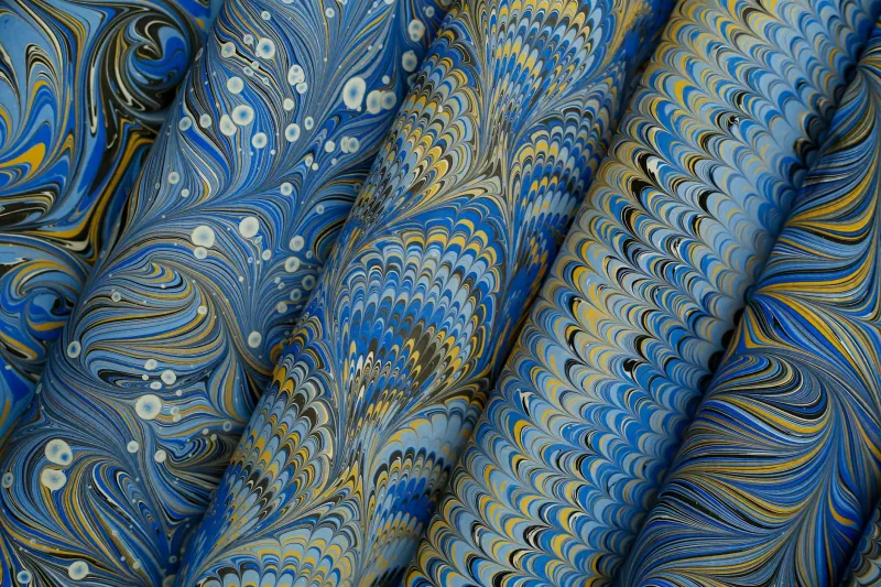
The movement began quietly in 2019 when several British publishers attended a typography workshop in Padova. What they discovered wasn't just beautiful letters—it was an entirely different philosophy of visual communication. Italian regional typography isn't decorative; it's documentary. Each region's letterforms evolved from local materials, tools, and cultural values.
Venetian scripts, born from the marriage of Byzantine influence and maritime trade, carry fluidity and grace. Tuscan letters, carved in stone and burnished by centuries of sun, possess weight and permanence. Milanese modernism, shaped by industrial precision, speaks in clean, confident lines.
"We realised British publishing had become culturally anaemic," says James Morrison of Archipelago Books in Edinburgh. "We were using fonts designed for corporate presentations to publish poetry about the Scottish Highlands. It was like serving haggis in a McDonald's wrapper."
 Photo: Scottish Highlands, via i.pinimg.com
The Terroir of Type
Morrison's press now employs letterforms inspired by Lombard manuscripts for their nature writing series. The slightly irregular baseline mirrors the undulating Scottish landscape, while the robust character weights echo the region's stone architecture.
"It's not about copying Italian typography," Morrison clarifies. "It's about understanding how place shapes letters, then applying that principle to our own geography and stories."
This philosophy—what designers are calling 'typographic terroir'—is spreading across Britain's independent publishing scene. Beacon Press in Bristol uses Neapolitan-inspired scripts for their urban fiction, the flowing ascenders and descenders mimicking the city's rolling hills. Tidal Books in Cornwall employs letterforms influenced by Ligurian coastal typography, where centuries of salt air have softened hard edges into organic curves.
The Rebellion Against Homogeneity
The movement represents more than aesthetic choice—it's cultural resistance. In an era of global homogenisation, these publishers are insisting that visual language can carry the memory of place.
"Amazon uses the same font whether they're selling books in Birmingham or Bangkok," observes Dr. Elena Rodriguez, a typography historian at Central Saint Martins. "These independent publishers are arguing that cultural products should look like they come from somewhere specific."
The commercial impact has been surprising. Despite—or perhaps because of—their unconventional typography, these publishers are finding devoted audiences. Their books photograph beautifully for Instagram, their distinctive spines create visual cohesion on shelves, and readers report stronger emotional connections to the content.
Beyond Aesthetics
What started as typographic experimentation is evolving into broader cultural dialogue. These publishers aren't just borrowing Italian letterforms—they're adopting Italian attitudes toward craft, patience, and regional identity.
"Italian typography evolved over centuries," explains Chen. "Each generation refined what came before while responding to contemporary needs. We're trying to bring that long-term thinking to British publishing, which has become obsessed with quarterly profits and viral marketing."
The movement is now influencing packaging design, exhibition graphics, and even architectural signage. British design studios are studying how Bolognese street signs differ from Roman ones, how Florentine shop fronts employ typography as cultural signalling.
The Future of Place-Based Design
As these publishers mature, they're beginning to develop distinctly British interpretations of regional typography. Letters that capture the industrial heritage of Manchester, the maritime history of Liverpool, the academic gravity of Oxford.
"We're not trying to be Italian," Morrison concludes. "We're trying to be more deeply British—to create visual languages that reflect our own landscapes, histories, and values. The Italians just showed us it was possible."
The revolution is quiet but persistent. One letter at a time, one book at a time, British publishers are proving that in our hyperconnected world, the most radical act might be insisting that things should look like they come from somewhere specific. In the geography of letters, they've found a way to make the global feel local again.