Forget everything you think you know about Italian design being all about bold gestures and dramatic flair. The real magic lies in seven fundamental principles that have quietly shaped centuries of exceptional creativity—from Renaissance masterpieces to modern furniture that makes you weak at the knees. Here's how to steal them for your own practice, no passport required.
1. Sprezzatura: The Art of Studied Carelessness
The Principle: True elegance appears effortless, even when it's anything but. This 16th-century concept, coined by Baldassare Castiglione, describes the art of making the difficult look easy—of hiding the labour behind the beauty.
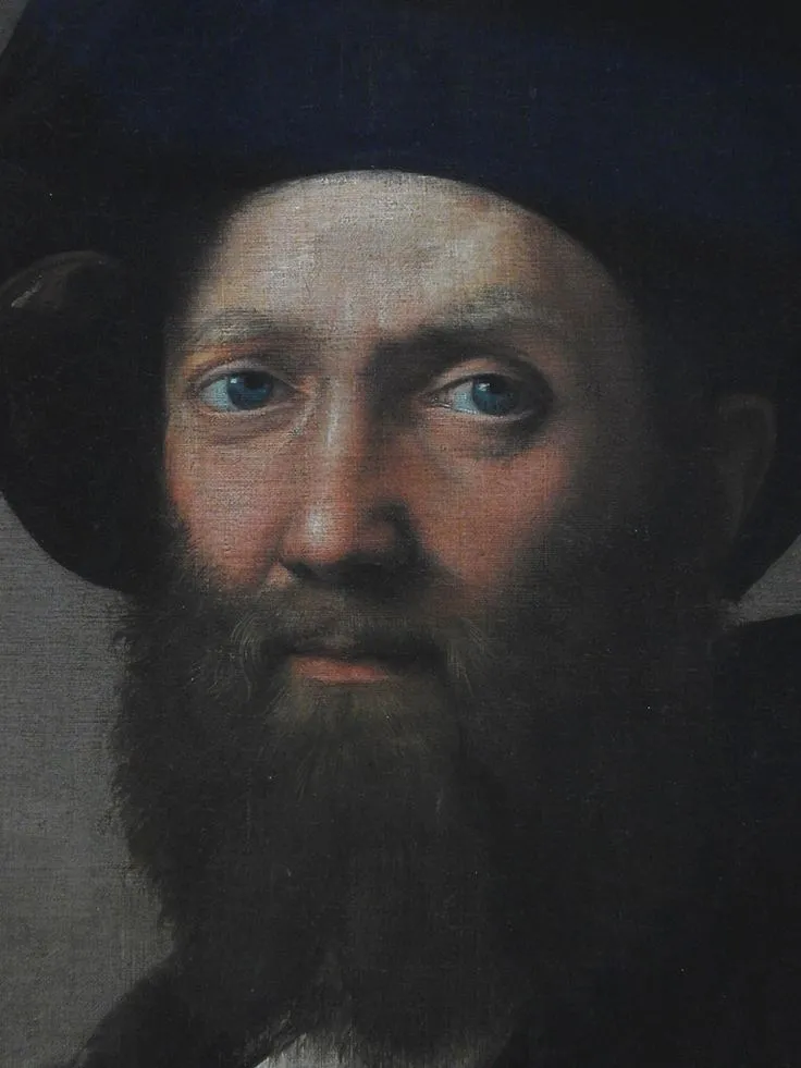 Photo: Baldassare Castiglione, via i.pinimg.com
How to Apply It: Stop overthinking your presentations. That perfectly aligned grid you spent hours perfecting? Consider introducing a subtle asymmetry that feels natural rather than forced. When designing a logo, resist the urge to make every element mathematically precise. Sometimes a hand-drawn flourish or a slightly imperfect curve communicates more humanity than pixel-perfect geometry.
Real-World Example: Look at how Italian fashion brands present their collections. The models appear to have casually thrown on £3,000 worth of carefully curated pieces. Apply this to your client presentations—prepare meticulously, then deliver with conversational ease. Your expertise should feel like natural conversation, not a rehearsed performance.
2. Bella Figura: Making a Beautiful Impression
The Principle: It's not vanity—it's respect. Bella figura is about presenting yourself and your work in a way that honours both your craft and your audience. It's the difference between showing up and making an entrance.
How to Apply It: Elevate every touchpoint of your creative practice. Your email signature, your invoice design, even the way you package deliverables—everything should reflect the same level of care you put into your core creative work. If you're a photographer, don't just send files in a generic folder. Create a branded viewing experience that makes clients feel special.
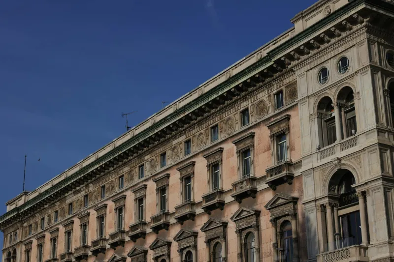
Real-World Example: Italian architect Carlo Scarpa was famous for designing custom door handles for his buildings. He understood that every detail contributes to the overall experience. Apply this thinking to your studio: invest in quality business cards, create beautiful proposal templates, design a studio stamp for your packaging. These aren't frivolous expenses—they're strategic investments in how people perceive your value.
3. Fare con Calma: The Power of Deliberate Pace
The Principle: Good work takes time, and rushing is the enemy of quality. This isn't about being slow—it's about being intentional with your timeline and allowing ideas to develop properly.
How to Apply It: Build buffer time into every project, not just for revisions but for reflection. After completing your first draft of any creative work—whether it's a logo, a room design, or a workshop outline—step away for at least 24 hours before reviewing. Fresh eyes often catch what rushed eyes miss.
Real-World Example: Italian furniture maker Cassina has been perfecting the same chair designs for decades, making subtle improvements with each iteration. Adopt this mindset: instead of constantly chasing new trends, identify your signature style elements and refine them continuously. Your clients will recognise and value this depth of expertise.
4. L'Arte di Non Finire: The Art of Strategic Incompletion
The Principle: Sometimes leaving something slightly unfinished invites the viewer to complete it with their imagination. Michelangelo's unfinished sculptures demonstrate this beautifully—they feel more alive because they suggest movement and possibility.
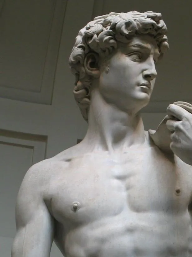 Photo: Michelangelo, via images.deepai.org
How to Apply It: Resist the urge to over-explain your creative concepts. Leave space for your audience to discover meaning. In branding work, this might mean choosing a logo that becomes more meaningful as people spend time with it, rather than one that communicates everything at first glance.
Real-World Example: Italian graphic designer Armando Testa was master of this principle. His posters often featured unexpected white space or elements that seemed to extend beyond the frame, creating intrigue rather than providing all the answers. Try this in your next presentation—end with a question rather than a conclusion, inviting collaboration rather than passive acceptance.
5. Chiaroscuro: The Drama of Light and Shadow
The Principle: Contrast creates depth and interest. This isn't just about literal light and dark—it's about creating tension between opposing elements to make both more powerful.
How to Apply It: In layout design, pair delicate typography with bold imagery. In interior projects, combine rough textures with smooth ones. In workshop facilitation, balance intense creative sessions with moments of reflection. The key is intentional opposition, not random contrast.
Real-World Example: Italian fashion brand Bottega Veneta built their reputation on this principle—pairing incredibly refined craftsmanship with deliberately understated presentation. Their "when your own initials are enough" philosophy creates powerful contrast with logo-heavy luxury brands. Consider what your creative practice could achieve by zigging where others zag.
6. Convivialità: Design for Connection
The Principle: The best design brings people together rather than isolating them. Italian design prioritises human interaction and shared experience over individual consumption.
How to Apply It: Before finalising any creative work, ask yourself: does this encourage connection or create barriers? If you're designing a restaurant interior, prioritise sightlines and acoustics that enable conversation. If you're creating a brand identity, ensure it feels approachable rather than intimidating.
Real-World Example: Italian piazzas are masterclasses in convivial design—they create natural gathering spaces without forcing interaction. Apply this thinking to your studio space: arrange seating to encourage collaboration, create areas where clients feel comfortable lingering, design your website to invite conversation rather than just showcase work.
7. Rispetto per i Materiali: Honour Your Medium
The Principle: Great Italian design respects the natural properties of materials rather than fighting against them. Wood should feel like wood, stone like stone, paper like paper. This authenticity creates work that ages beautifully rather than looking dated.
How to Apply It: Choose tools and techniques that complement your natural working style rather than forcing yourself into trending methodologies. If you're naturally a sketcher, don't abandon that for purely digital processes. If you think best while walking, build movement into your creative routine.
Real-World Example: Italian architect Renzo Piano's buildings celebrate their materials—glass curtain walls that play with light, steel structures that show their strength, timber elements that age gracefully. Whatever your medium—pixels, words, clay, or space—let its inherent qualities inform your approach rather than imposing an external aesthetic.
Bringing It All Together
These principles work best in combination, not isolation. The Italian creative tradition succeeds because it treats all seven as interconnected elements of a larger philosophy: that good design serves life, not the other way around.
Start by choosing one principle that resonates most strongly with your current challenges. Spend a month consciously applying it to every project, then gradually layer in the others. Within six months, you'll find your creative practice has developed a new depth and confidence that clients notice immediately.
Remember: these aren't rules to follow rigidly, but lenses through which to view your creative decisions. The goal isn't to become Italian—it's to become more intentionally yourself, guided by centuries of wisdom about what makes creative work truly memorable.
The Italians have spent generations perfecting these approaches. Now it's your turn to make them your own.