There's something almost alchemical happening in studios across Britain. Artists and designers are taking the sun-baked ochres of Tuscany, the deep earth tones of Siena, and the weathered patinas of Venetian facades, then filtering them through our own rain-soaked landscape. The result is a colour palette that feels both ancient and utterly contemporary—distinctly British, yet touched by Italian soul.
The Great British Colour Awakening
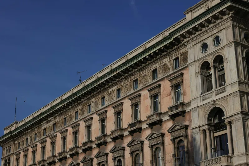
For too long, British design has been trapped between two extremes: the stark minimalism of Scandinavian influence or the saccharine pastels of shabby chic. But a growing movement of UK creatives is finding inspiration in Italy's centuries-old relationship with natural pigments, adapting these traditions to reflect our own landscape's subtle beauty.
"I spent three months in a Florentine workshop learning traditional fresco techniques," explains Manchester-based interior designer Lucy Harrison. "When I returned to the Peak District, I saw our countryside completely differently. Those misty mornings, the lichen on dry stone walls, the way light filters through our clouds—it all suddenly made sense as a palette."
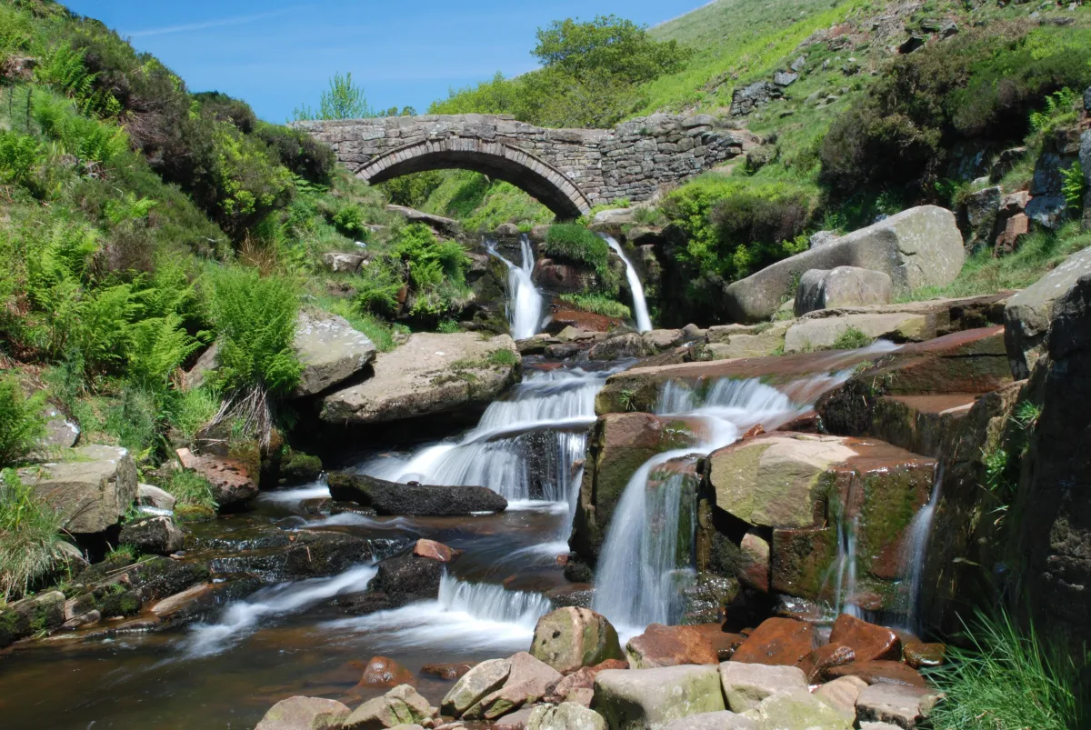 Photo: Peak District, via the-yorkshireman.com
Harrison's work now features what she calls 'British earth tones': muted sage greens reminiscent of Yorkshire dales, soft grey-browns that echo Cotswold stone, and dusty blues pulled from Scottish loch reflections. But the way she mixes and applies these colours follows Italian principles learned in that Tuscan workshop.
The Science of Subtle
Traditional Italian pigment-making isn't just about colour—it's about understanding how natural materials interact with light, surface, and time. These techniques, when applied to British-inspired palettes, create something remarkably sophisticated.
Colour specialist Dr. Emma Thompson, who runs workshops on natural pigment preparation from her studio in Bath, explains the process: "Italian earth pigments have this incredible depth because they're made from actual earth—iron oxides, clay minerals, ground stone. When you apply the same techniques to British materials—think Cornish clay, Welsh slate dust, Scottish granite—you get colours that seem to breathe."
The key lies in layering. Rather than using flat, manufactured colours, this approach builds up translucent layers of natural pigments, creating the kind of visual depth that makes Italian frescoes so compelling. Applied to British tones, it transforms muddy greys into luminous neutrals and dull greens into complex, shifting hues.
Practical Magic for Modern Makers
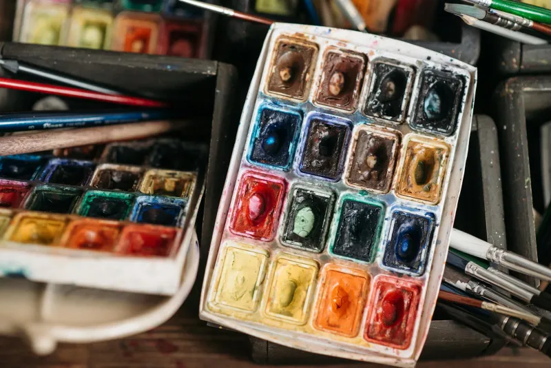
You don't need a Florentine workshop to experiment with this approach. London-based illustrator James Park has developed a contemporary interpretation using readily available materials. "I start with traditional watercolour techniques but build my own 'British earth' palette using natural pigments sourced from UK suppliers," he explains.
Park's method involves creating custom colour mixes using:
- Raw umber and burnt sienna as base earth tones
- Payne's grey mixed with yellow ochre for those distinctive British green-greys
- Titanium white tinted with the faintest touch of raw umber for that pearl-grey British light
- Quinacridone violet mixed with yellow ochre for the purple-brown of winter bracken
"The trick is thinking like a fresco painter," Park notes. "Build up transparent layers, let the white ground show through, and always consider how the colour will look in different lights—crucial in Britain where the light changes every five minutes."
Digital Applications
This earth-meets-rain aesthetic isn't limited to traditional media. Graphic designers are translating these organic colour relationships into digital work, creating brand palettes that feel both grounded and sophisticated.
Brighton-based brand designer Melissa Chen has built her practice around what she calls 'Neo-British' colour palettes. "Corporate clients are tired of bright, shouty colours," she explains. "They want sophistication, heritage, authenticity. These Italian-influenced British earth tones give them all of that."
Chen's digital interpretations maintain the layered complexity of traditional pigments through careful attention to undertones and subtle gradations. Her colour palettes often feature five to seven closely related tones that work together like a traditional fresco—creating harmony through subtle variation rather than stark contrast.
The Emotional Landscape
What makes this colour approach particularly relevant for British creatives is its emotional resonance. These aren't the bold, optimistic hues of Mediterranean summers, but the contemplative tones of our own landscape—colours that speak to resilience, endurance, and quiet beauty.
"There's something deeply comforting about these colours," observes textile designer Sarah Morton, whose Welsh studio overlooks the Brecon Beacons. "They're the colours of home, but refined through centuries of Italian understanding about how colour works. It's like putting on a perfectly tailored coat—familiar, but elevated."
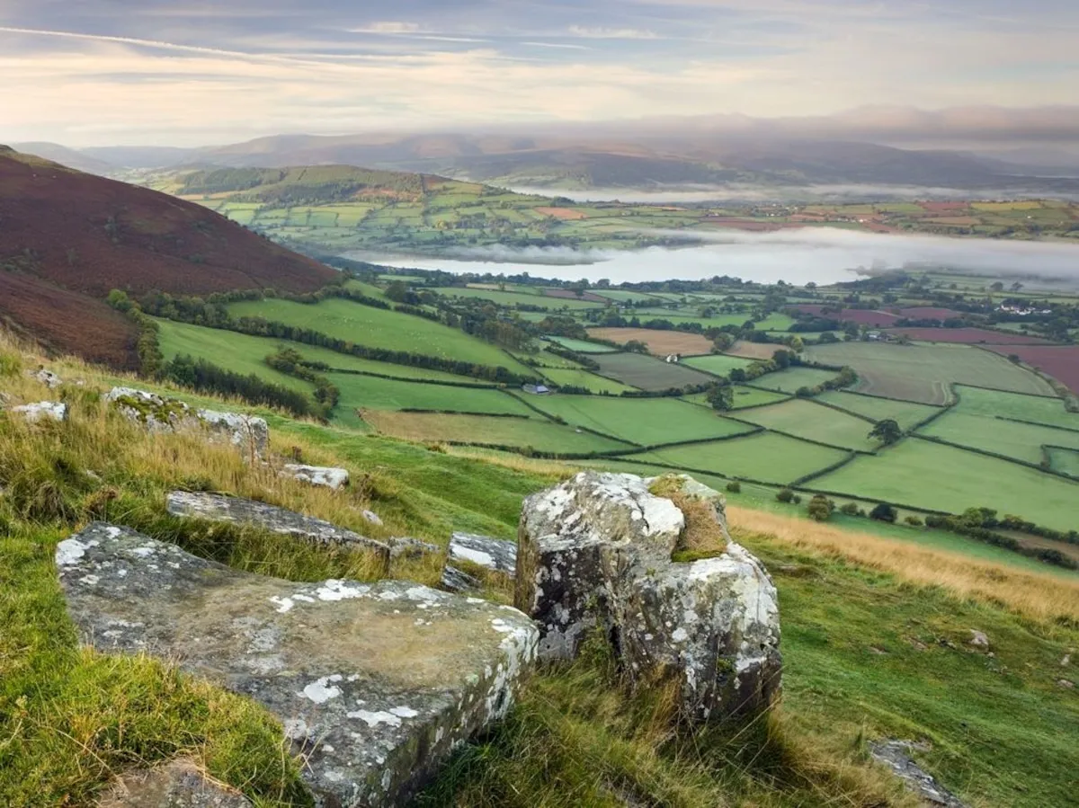 Photo: Brecon Beacons, via i.natgeofe.com
Morton's latest collection features hand-dyed fabrics in what she describes as 'mountain mist' tones—greys and blue-greys that shift subtly depending on the light, much like the Welsh valleys that inspire them.
Building Your British Earth Palette
For creatives wanting to explore this approach, start with observation. Spend time really looking at the British landscape—not the picture-postcard version, but the everyday reality of our countryside and cities. Notice how colours shift in our changeable light, how stone and vegetation create subtle harmonies, how weather affects the appearance of familiar surfaces.
Then experiment with building these observations into layered colour relationships. Whether you're working in paint, pixels, or fabric, the principle remains the same: create depth through transparency, harmony through subtle variation, and beauty through understanding the materials you're working with.
This isn't about copying Italian techniques wholesale, but about applying Italian wisdom to British sensibilities. The result is a colour palette that's uniquely ours—rooted in place, refined by tradition, and perfectly suited to our complex, ever-changing light.