Tribal Colours: How Siena's Medieval District Wars Are Teaching British Brands the Art of Visual Belonging
The Colours of Conflict
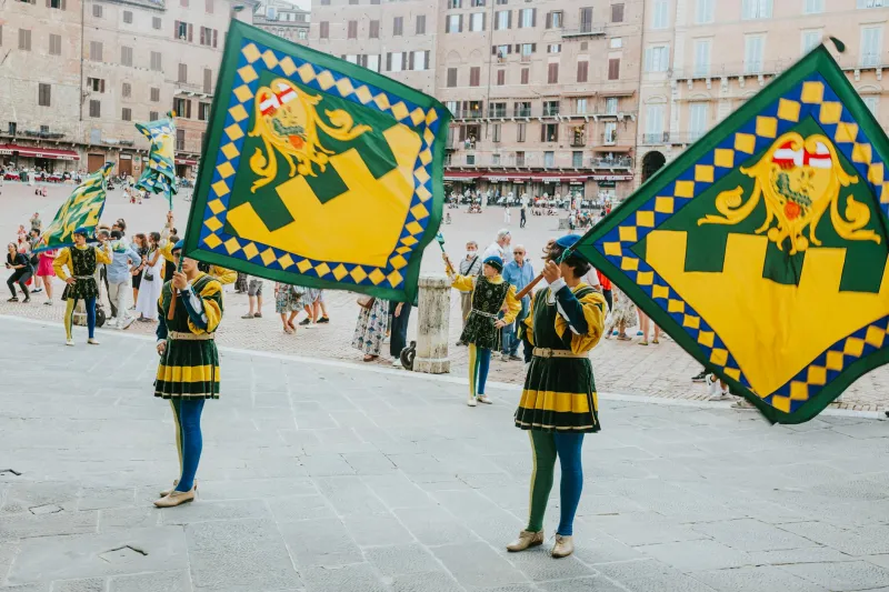
Twice each summer, the medieval Italian city of Siena erupts in a explosion of colour as seventeen distinct neighbourhoods compete in the legendary Palio horse race. But the real spectacle isn't the ninety-second race itself – it's the year-round visual warfare between the contrade, each neighbourhood maintaining its own heraldic colours, symbols, and fierce territorial pride that has endured for over seven centuries.
This isn't mere tradition for tradition's sake. Siena's contrada system represents perhaps the world's most successful example of community visual identity, where colour and symbol create genuine emotional belonging that transcends generations. Now, British creative professionals are studying this medieval masterclass in brand loyalty to understand what authentic visual identity actually means.
Beyond the Trend Cycle
Walk through any British high street and you'll witness the visual homogenisation that defines contemporary branding. Millennial pink gives way to Gen-Z yellow, minimalist sans-serifs replace ornate scripts, and entire industries adopt identical colour palettes as if controlled by some invisible design dictator.
"We've mistaken fashion for identity," observes Manchester-based brand strategist Claire Pemberton, who spent six months studying Siena's visual culture. "British brands chase trending colours and typography like teenagers following influencers. But the contrade have maintained their visual languages for centuries because they're rooted in story, place, and genuine community rather than aesthetic whim."
The contrast is instructive. While contemporary British branding often prioritises broad appeal and market research, each Siena contrada developed its visual identity through historical accident, geographical necessity, and cultural evolution. The result is seventeen completely distinct visual languages that feel authentic rather than manufactured.
The Logic of Belonging
The Onda (Wave) contrada claims deep blue and white, colours that reference both the neighbourhood's proximity to ancient water sources and its residents' traditional occupations as dyers and textile workers. These aren't arbitrary aesthetic choices but visual expressions of genuine community identity.
Contrast this with the Nicchio (Shell), whose yellow and blue palette reflects both the neighbourhood's location near medieval shell-trading routes and its patron saint's traditional colours. Every visual element tells part of a larger story that residents genuinely live rather than simply purchase.
"What struck me most about the contrade system is how colour becomes emotional infrastructure," explains Edinburgh design studio founder Ross MacKenzie. "These aren't just pretty palettes – they're visual languages that create immediate recognition, emotional connection, and social belonging. When a Sienese person sees their contrada colours, they're seeing their identity reflected back at them."
The British Opportunity
Several forward-thinking British creative studios are beginning to apply contrada principles to their own visual identity development. Rather than selecting colours based on aesthetic preference or market research, they're exploring what genuine connection to place, purpose, and community might look like visually.
London architecture firm Groundwork Studio recently rebranded using colours extracted from the specific brick types found in their Hackney neighbourhood. Their palette of warm terracotta, weathered cream, and industrial grey directly references the visual DNA of their local environment.
"We realised we were trying to appeal to everyone and therefore connecting with no one," explains founding partner Sarah Chen. "The contrada model taught us that restriction creates authenticity. By limiting ourselves to colours that genuinely reflect our place and practice, we've created something that feels rooted rather than trendy."
The Psychology of Territorial Design
What makes Siena's system particularly relevant for contemporary British creatives is its understanding that visual identity functions as psychological territory. Each contrada's colours don't just identify – they claim space, assert presence, and create boundaries that define community membership.
Bristol-based graphic designer Tom Weatherby has applied this territorial thinking to his studio's approach to client work. "Instead of asking 'what colours are trending?' we now ask 'what visual territory does this brand want to claim?'" he explains. "A bakery in Totnes requires different territorial markers than a tech startup in Shoreditch. The colours need to reflect not just aesthetic preference but genuine cultural positioning."
This approach has led to more distinctive and memorable brand identities that resist the gravitational pull of design trend cycles. Clients report stronger emotional connections to their visual identities and improved recognition in crowded marketplaces.
Building Your Creative Contrada
Developing a contrada-inspired visual identity begins with honest assessment of your genuine community and values. Rather than aspirational positioning or market-tested messaging, the process requires identifying the authentic cultural territory your brand or practice occupies.
Start with place. What visual elements genuinely reflect your geographical location, from local architecture and natural features to historical industries and cultural traditions? Siena's contrade drew inspiration from immediate environment rather than distant aesthetic influences.
Consider purpose with equal specificity. What do you actually do, for whom, and why does it matter? The most successful contrada-inspired identities emerge from genuine professional mission rather than generic creative ambition.
Finally, examine community. Who are your actual collaborators, clients, and peers? What visual languages already exist within your genuine professional tribe? Authentic identity often emerges from conversation with existing community rather than attempts to appeal to imaginary audiences.
The Courage of Distinction
Perhaps the most challenging aspect of contrada-inspired identity development lies in accepting limitation. Siena's neighbourhoods succeed precisely because they don't try to appeal to everyone – they create powerful belonging for specific communities whilst remaining completely irrelevant to others.
This selectivity requires courage that contemporary British branding often lacks. The fear of excluding potential clients or appearing too niche drives many creative businesses towards safe, generic visual choices that offend no one whilst inspiring nobody.
"The contrade taught me that trying to be everything to everyone is the fastest route to being nothing to anyone," reflects London-based illustrator Emma Richardson, whose recent rebrand uses colours inspired by the specific lichen patterns found on Yorkshire stone walls near her childhood home.
"It felt risky to base my entire visual identity on something so specific and personal. But the response has been incredible – clients choose me precisely because my work feels rooted in genuine place and story rather than generic creative services."
The Long Game
What ultimately distinguishes Siena's contrada system from contemporary branding trends is its commitment to longevity over novelty. These visual identities have survived wars, plagues, political upheavals, and dramatic social change because they're anchored in enduring truths about place and community rather than fleeting aesthetic preferences.
For British creative professionals willing to embrace this longer view, the contrada model offers liberation from the exhausting cycle of constant rebranding and trend-chasing. By developing visual languages rooted in genuine identity rather than market positioning, creative businesses can build the kind of authentic recognition that transcends fashion and creates lasting professional legacy.
The medieval streets of Siena continue to pulse with centuries-old colour rivalries that feel as fresh and relevant today as they did in 1300. Perhaps it's time for British creativity to learn from this ancient wisdom: that the most powerful brands aren't built on what everyone else is doing, but on what only you can authentically claim.